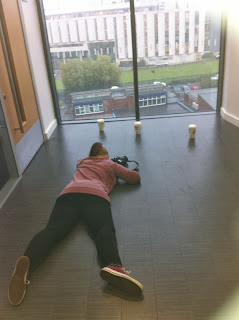
Here are some photographs from the shoot.
I think that for something that we had to create so quickly that we did a very good job. We gave inanimate objects personalities which was something that I love doing and intend to use in other projects (even my final production project).
Stop motion is a passion of mine and something that I have always loved so I am happy that we went with my idea because I was able to practice my stop motion techniques during the shoot and also in post production.
So, there is nothing really left for me to do but show you the video! And after that I will give myself and my group some constructive criticism and things to think of for next time!
I love our little stop motion; really think that we used the triptych technique well and also had a story within it. We used different amounts of screens at a time to make the piece a bit more exciting than just having 3 shots constantly. This made the scenarios a bit more dramatic such as when Kelly realised that Toby has thrown himself down the stairs! (Very dramatic, I should have added that there were disturbing scenes of coffee suicide).
I think that given more time we would have been able to take more photographs and make the stop motion itself run a lot more smoother that it currently does. We tried our best in the post production to get all the frames the correct size but occasionally they are not. This isn't too noticeable but because we worked on it we definitely can see the wrong points.
We also had to play around with the brightness and contrast on some of the photographs because they didn't match up all the way through. This was mainly due to the change in light throughout the day but we could have helped by changing the settings on the camera. Next time I use a 7D I know how to do this though so hopefully will improve my work quality.
Anyway, I hope you all like this silly little video!
Speak Soon!
Speak Soon!


.JPG)
No comments:
Post a Comment